

Tracking an Ingredient's Cost Over Time
Contents6 sections
Ingredient Cost Trend is the receipt on your supplier. It charts what an ingredient actually cost you per unit each time stock arrived, so a price move stops being a feeling and becomes a number you can point at.
Before you start
The chart is built from stock arriving — deliveries you received, prep batches you made, and shipments in from a hub. An ingredient needs at least one of those before there's anything to plot.
Reading the chart
-
Open Reports → Business Reports → Ingredient Cost Trend.
-
Pick an ingredient from the Ingredient picker. The subheading names it, and nothing plots until you choose one.
-
Adjust Start Date and End Date if you want. It opens on the last four weeks. Deliveries land about monthly, so widen it when you want a price move to read as a trend rather than a blip — you can go back as far as March 2026.
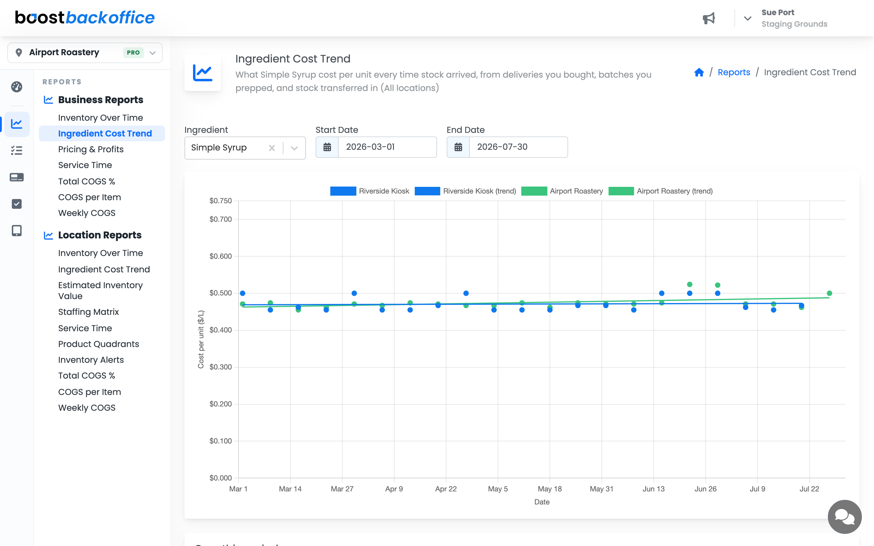
Each dot is one day stock arrived, priced at what it cost per unit that day: everything that arrived that day, totalled and divided by how much arrived. Totalling first matters — one delivery usually lands as several lines, and averaging them properly is what keeps the number honest. The left axis names the unit the ingredient is tracked in, so you can tell at a glance whether you're reading a cost per litre, per pound, or per each.
The dots deliberately aren't joined up. Nothing happens to your cost in the weeks between two deliveries, so a line across that gap would draw a story the data doesn't tell. The line through them is the trend — a best fit through the dots, and the part that answers "am I paying more than I was?"
A flat trend is good news: your supplier price is holding. What deserves attention is a trend that climbs, or a cluster of dots that steps up and stays up — that's a rise you're now paying on every order.
Tip
Widen the range when you're checking a supplier properly. A short window can sit entirely inside one price and look reassuringly flat.
If you both buy it and make it
Some ingredients arrive both ways — you usually buy the syrup, but you make it yourself when you run out. Buying and making almost never cost the same, so those points would otherwise look like a wildly swinging price.
When that happens the chart marks each point by how the stock arrived: a round point is stock you bought, a triangle is a batch you made, and a diamond is a day you did both. A note above the chart says the same. If a trend slopes down, check the shapes before celebrating — it may be telling you that you switched to making it, not that anyone's price fell.
The numbers, without reading the slope
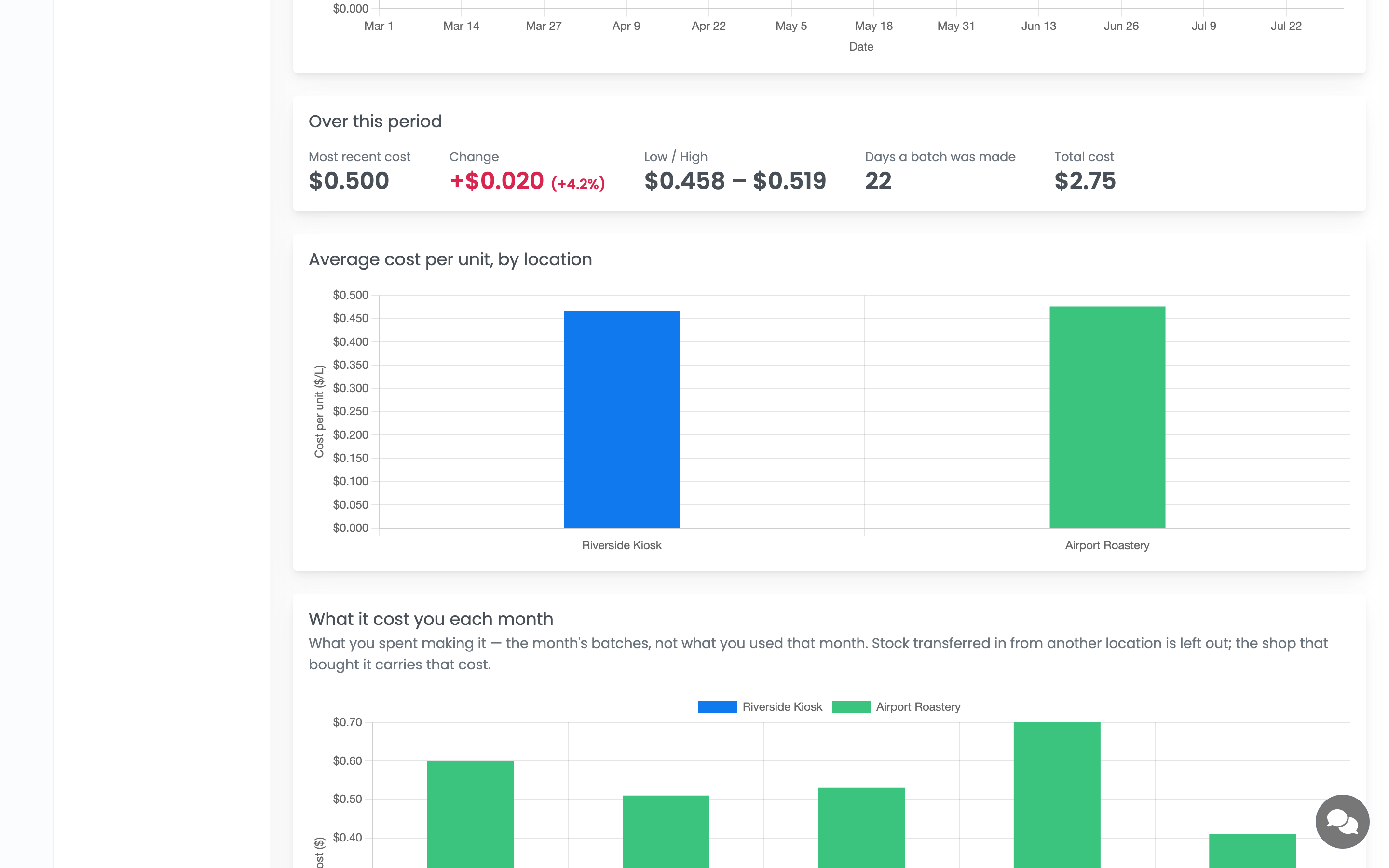
Over this period answers the question outright rather than making you judge a line by eye: what you paid most recently, how much that moved in both currency and percent, the low and high, how many days stock arrived, and what the whole lot cost. Cheap ingredients are shown to a tenth of a cent — something bought by the ounce at 2.5c would otherwise read as either 2c or 3c. For an ingredient you make in-house that middle figure counts days a batch was made instead.
Note
Total cost counts only what you bought or made. Stock shipped in from another one of your shops was paid for there and is already counted against it — adding it again would report more spent than you spent. The unit-cost figures and the count of days do include it, because a transferred case genuinely arrived, at that price.
Average cost per unit, by location sits beneath, turning the shop-versus-shop comparison into a bar you can read at a glance instead of untangling overlapping dots. It appears only on the business-wide report — the location version is already one shop.
What it cost you
Unit cost isn't the whole story. An ingredient can creep up barely a cent and still be your biggest increase, simply because you buy so much of it. This card totals what the ingredient cost, stacked by location so you can see which shop it came from. It counts by week on a range of about three months or less and by month on anything longer, so a short range still gives you more than one bar.
It counts what you spent getting the ingredient, not what you used. A note on the card says as much, because "what it cost you" reads as consumption to most people. Every bar is that period's deliveries and prep batches, so this card won't reconcile against a COGS report, and isn't meant to. Stock transferred in is left out here too, for the same reason it's left out of Total cost.
Read it against the chart above: monthly cost climbing while the unit cost stays flat means you bought more, not that anyone raised a price.
Comparing what each shop pays
The business-wide report gives each location its own dots and its own trend line. That's the comparison worth opening it for — a site quietly paying more for the same ingredient separates out instead of disappearing into an average.
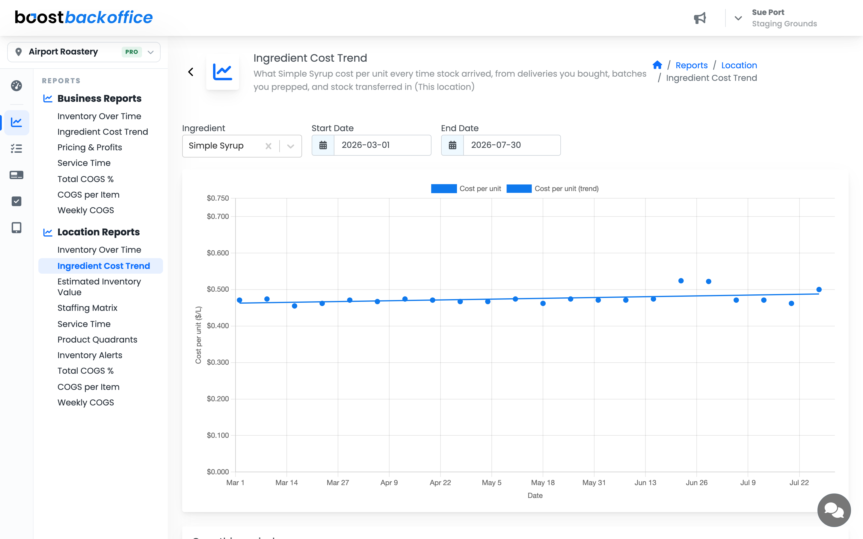
A location with only one delivery in the window gets a dot and no trend line: a single point isn't a direction. Use Reports → Location Reports → Ingredient Cost Trend when you want one shop on its own.
Note
The Business Reports version covers every location on the account, so it's available to owners and managers whose access isn't limited to specific shops. If your account limits you to one location, use the Location Reports version.
What you should see
A row of dots at your supplier price with a flat trend line through them, stepping up on the day a price rise landed. If the chart is empty, nothing arrived for that ingredient in the window — widen the dates, or receive an order for it to start building its cost history.
Account Level: All